A Retro Revamp for a Chicago Classic
Viking Ski Shop, a beloved midwest institution, enjoys a deeply loyal customer base. However, years of neglect had rendered the shop disorganized, with outdated displays, clutter and ineffective signage.
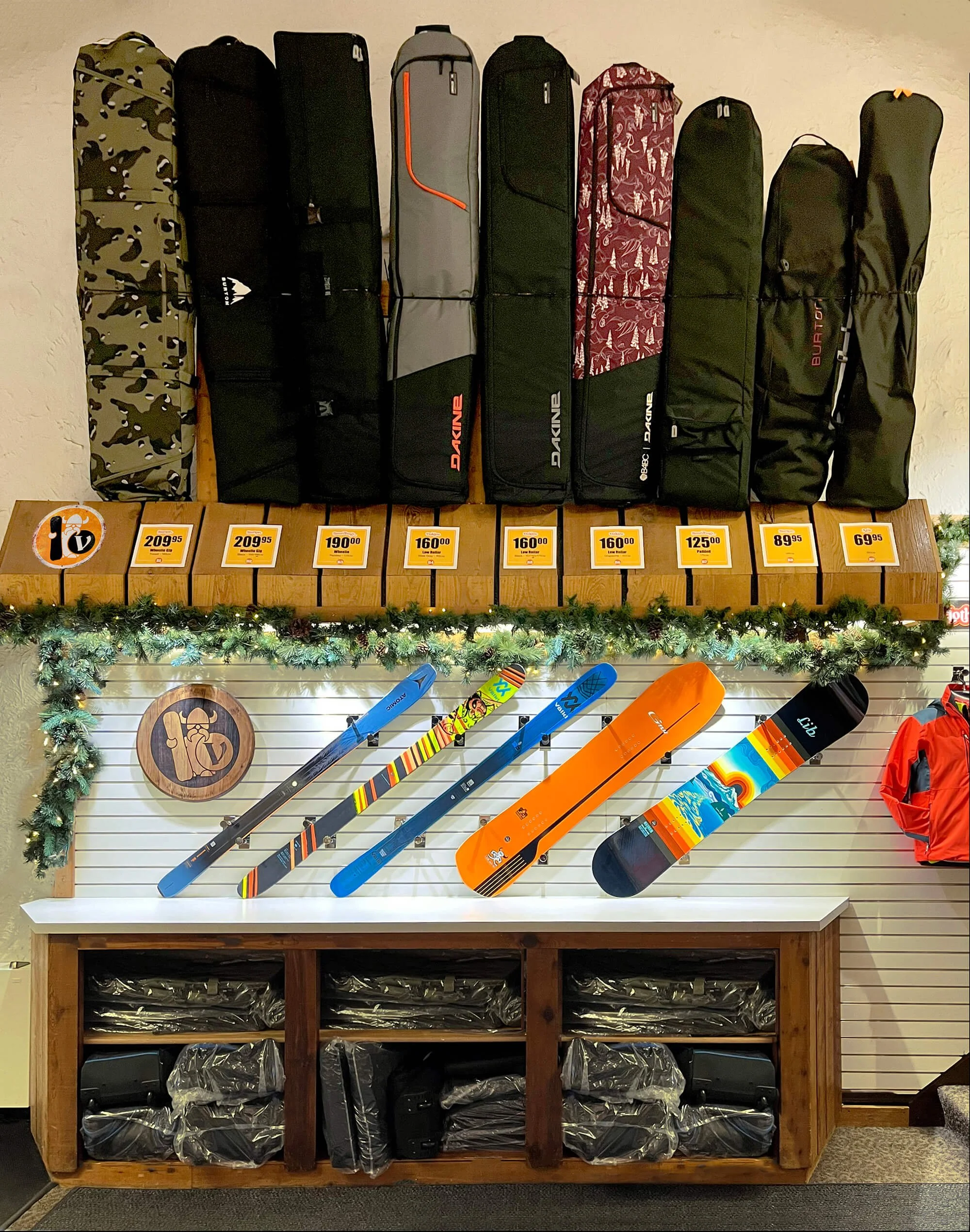
The shop's retro 1970s vibe was revitalized with orange, an original brand color, introducing vibrant new signage and revamped product displays, optimizing every inch to boost sales.
Logo Refresh
Recognizing the shop’s snowboard clientele is an important step in modernizing. A secondary logo was developed, featuring the iconic viking image with a snowboard. This fresh branding now appears on signage and promotional items, updating the store’s look while preserving its history and classic charm.


